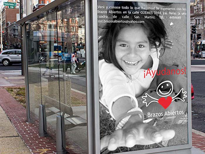
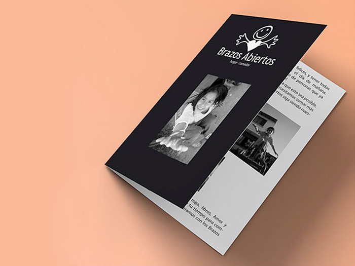
Brazos Abiertos is a Children’s Home and Shelter based in Mendoza, Argentina. It depends on donations and volunteers, and while it is a beloved organization they usually have limited resources.
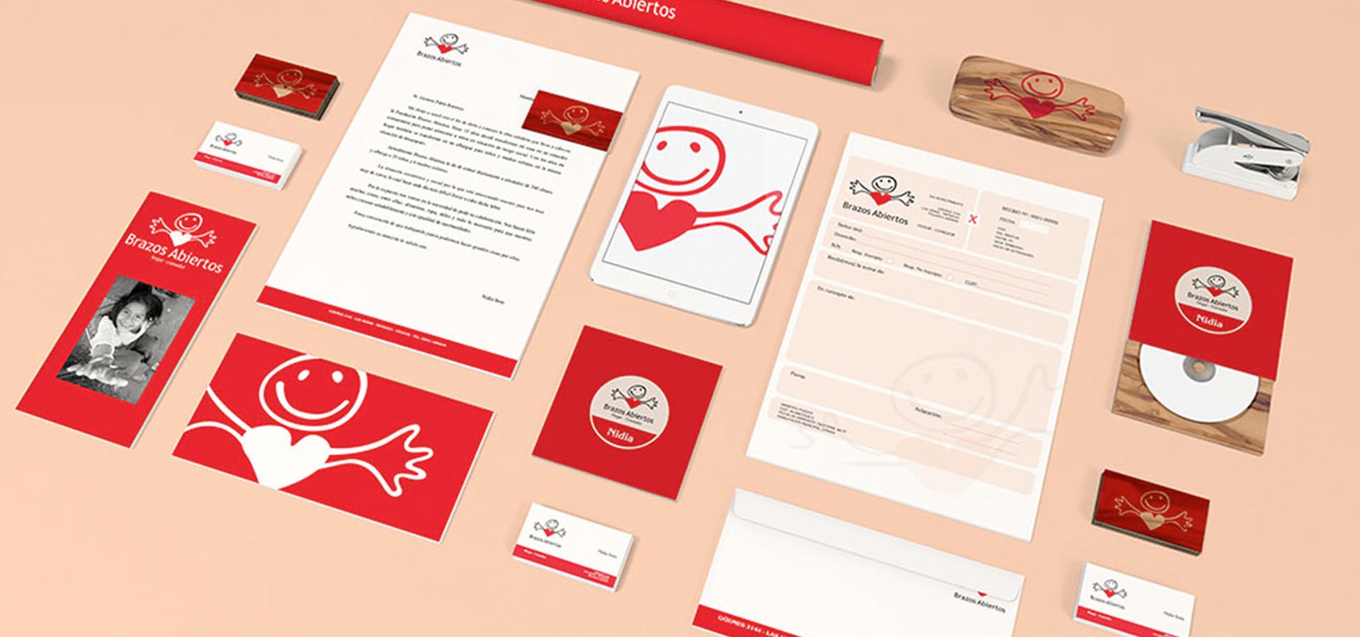
The goal was to make a friendly brand that symbolizes the spirit of the non-profit. The visual system has been designed to be very budget-friendly and flexible.
Project Details
Client Brazos Abiertos
Skills Branding
It was very important to make the kids part of the identity.
Their personality, struggles, and joy all are an intrinsic part of the non-profit. The brand reflects exactly that.
Keeping costs down was imperative.
The visual system only uses 2 colors and every piece is conceived to work in black and white, allowing for cheap photocopies for reproduction.