
Ten-Digit Inc. is focused on providing subscription-based phone services through the Internet.
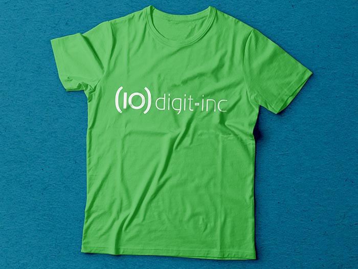
The logo is based on the traditional formatting convention for a 10 digit U.S. phone number; and takes the parenthesis as a system element to expand the identity using patterns.
Project Details
Client Ten-Digit Inc
Skills Branding
The Parenthesis are the linking element throughout the brand.
Patterns are formed by using them as a module, giving the brand life and variety on what is usually a very ‘corporate’ looking market.
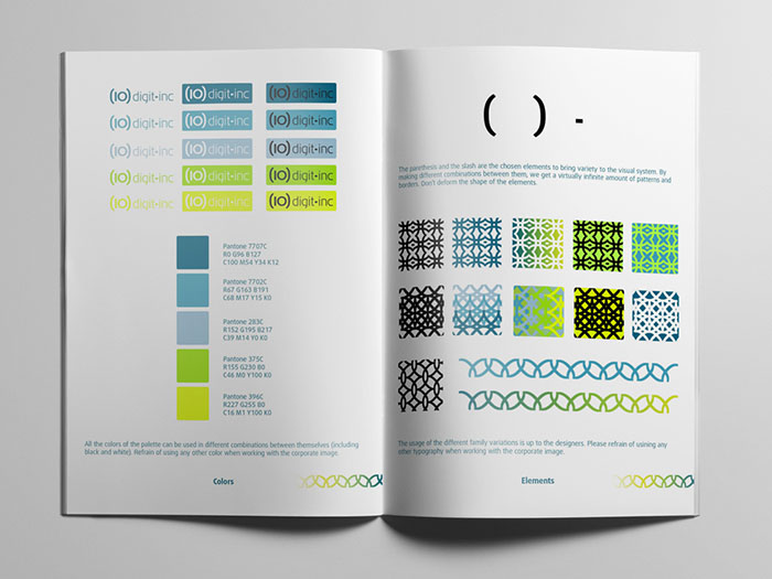
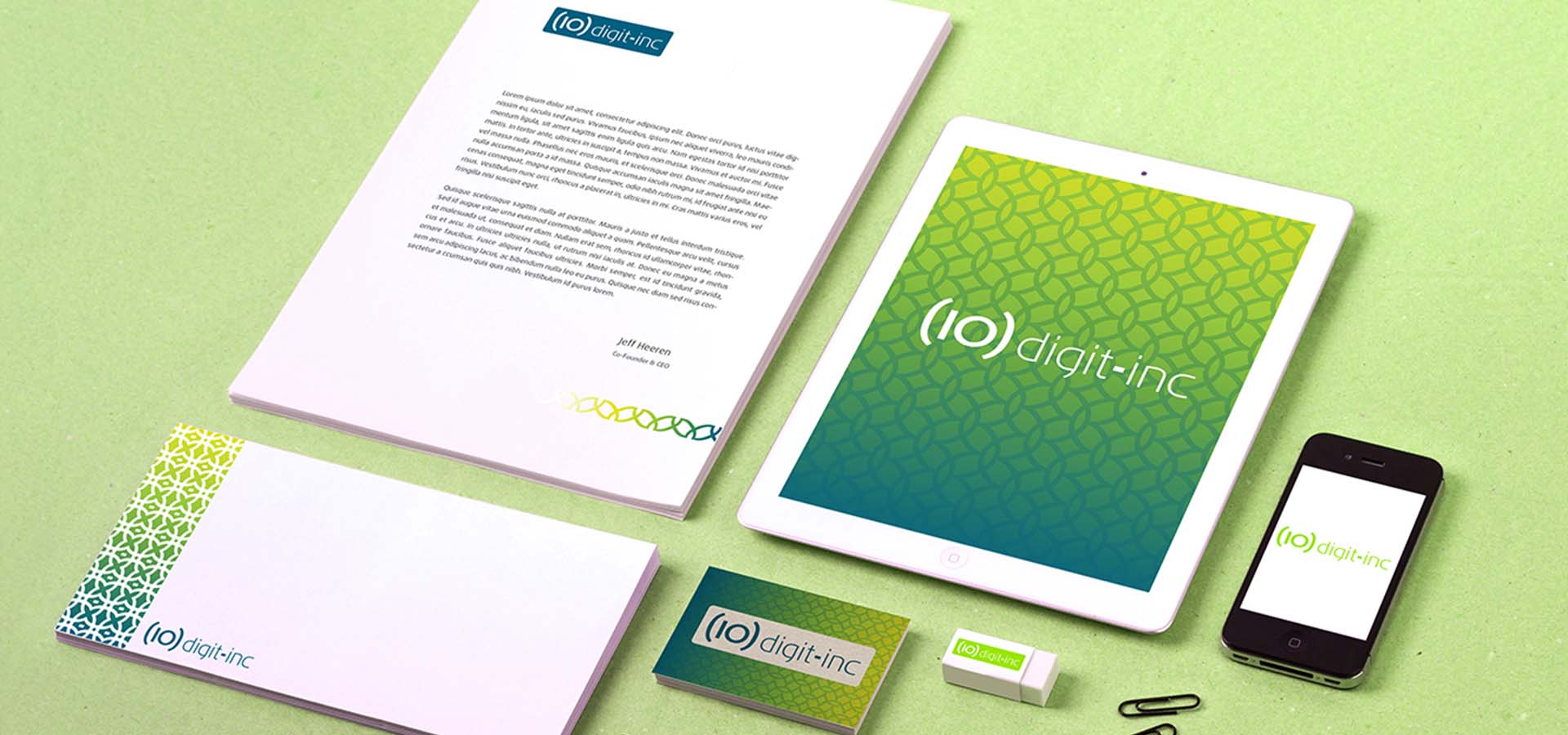
The color palette makes Ten-Digit Inc stand out from its competitors.
The combination of blues, greens and yellows aligned with the technological approach of the company, while maintaining a fresh look.